Skip to content
5 Easy Secrets for an Elegant Wedding Color Palette
Selecting your design tones stands as one of the most exciting chapters of your planning journey. However, many contemporary couples struggle to find the right place to begin. With so many ideas online, you can easily feel overwhelmed by too many options. Because of this, focusing on shades that reflect your personal lifestyle keeps your decisions simple. At Sirenna Studio, we believe your selected shades should enhance your celebration and design a timeless atmosphere. Here are our secrets to choosing your ideal Wedding Color Palette without stress
1. Let Your Destination Nature Guide Your Color Choices
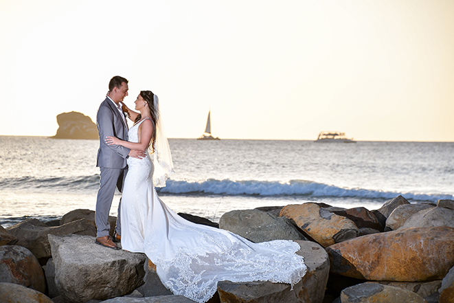
Your tropical destination can easily inspire your entire design palette. Instead of competing with the local scenery, let nature guide your creative decisions. For example, you can choose soft blues to match ocean views or vibrant greens for tropical gardens. You might also select warm neutrals for sunset celebrations or rich earth tones for natural settings. These colors consistently feel balanced, sophisticated, and incredibly elegant.

2. Match Your Tones to the Mood You Want to Create
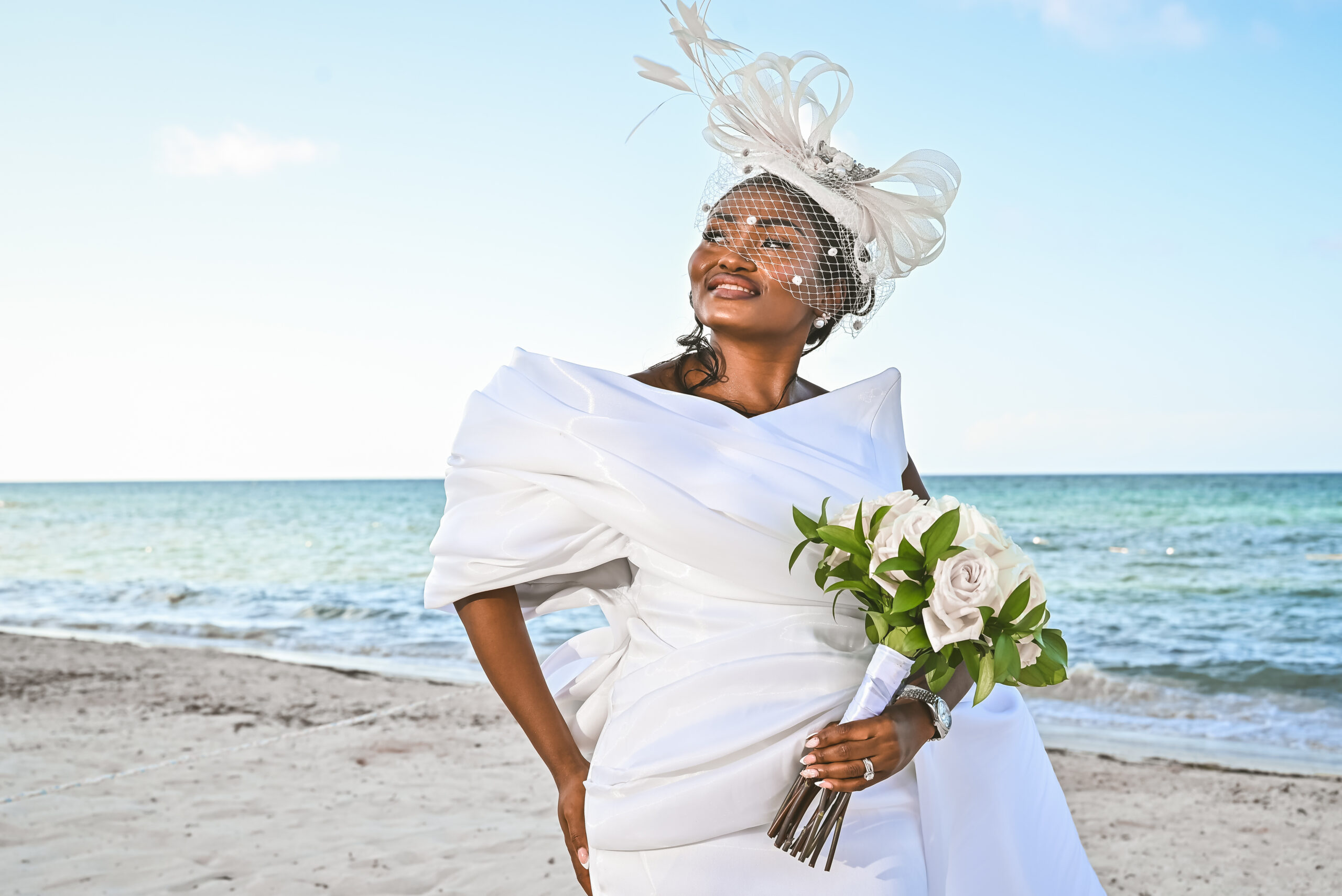
Colors trigger deep physical emotions. Because of this, your palette should actively match the specific feeling you want your guests to experience. For instance, white and green combinations always feel fresh and clean, while soft blue creates a calm atmosphere. Blush tones design a romantic look, whereas warm terracotta or bold tropical colors add rich energy. Choose shades that tell your authentic story.
3. Keep Your Palette Simple to Protect Your Visual Style
You can easily fall in love with many different beautiful colors at once. However, incorporating too many distinct shades can make your overall design feel chaotic. Instead, you should choose one main base color, one secondary tone, and one or two accent colors. This simple approach creates a clean, intentional, and timeless look. It also makes your floral planning and venue decorating significantly easier.

4. Align Your Design Choices with the Local Tropical Season
The specific time of year should always influence your color choices. Soft pastels work beautifully for spring celebrations, while summer pairs naturally with vibrant, saturated tones. Warm earth tones look stunning during autumn months, and rich, deep shades feel incredibly elegant for winter events. Your selected palette should always feel natural for the season and the local weather. This alignment ensures your wedding photographs look cohesive, balanced, and visually stunning.
5. Prioritize Timeless Elegance over Passing Social Media Trends
Creative wedding trends change rapidly every single year. However, your visual memories and family photographs will last forever. Instead of choosing popular colors simply because they trend online, choose tones that you will still love decades from now. Classic, simple palettes rarely go out of style. When you let your personality lead every design decision, your celebration naturally feels authentic, relaxed, and incredibly beautiful.
Conclusion
In conclusion, your design palette does much more than simply decorate a physical venue. It actively helps design the emotional atmosphere for one of the most important days of your life. Keep your choices simple, stay true to your natural style, and select colors that make you smile. At Sirenna Studio, we believe your celebration deserves absolute elegance, guiding you as you design an elegant wedding color palette that reflects your true love story. Let us protect your precious family heritage with refined, timeless photography that lasts forever in paradise.