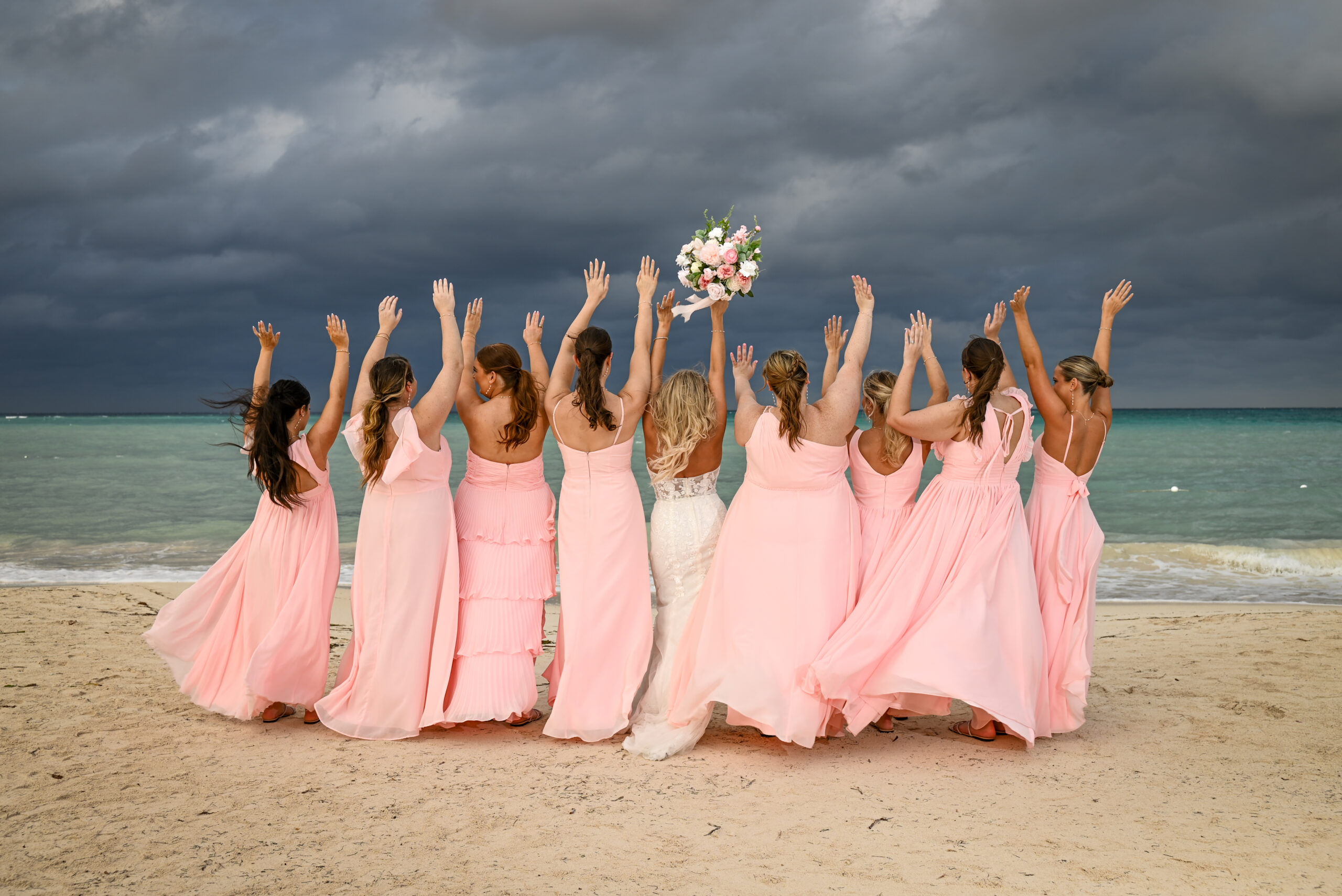
Wedding Color Palette Selection: Timeless Design Guidelines
Choosing colors for your celebration feels like one of the most exciting aspects of wedding design.
However, moving from inspiration boards to physical venue styling often brings uncertainty.
Couples worry whether chosen tones will clash with natural landscapes or feel outdated years later.
At Sirenna Studio, we capture how color palettes interact with natural light, organic textures, and editorial portraiture.
Anchoring Tones to Your Destination Landscape
Instead of selecting shades in isolation, look closely at your surrounding environment.
A coastal shore, lush jungle enclave, or historic hacienda already contains a rich natural palette.
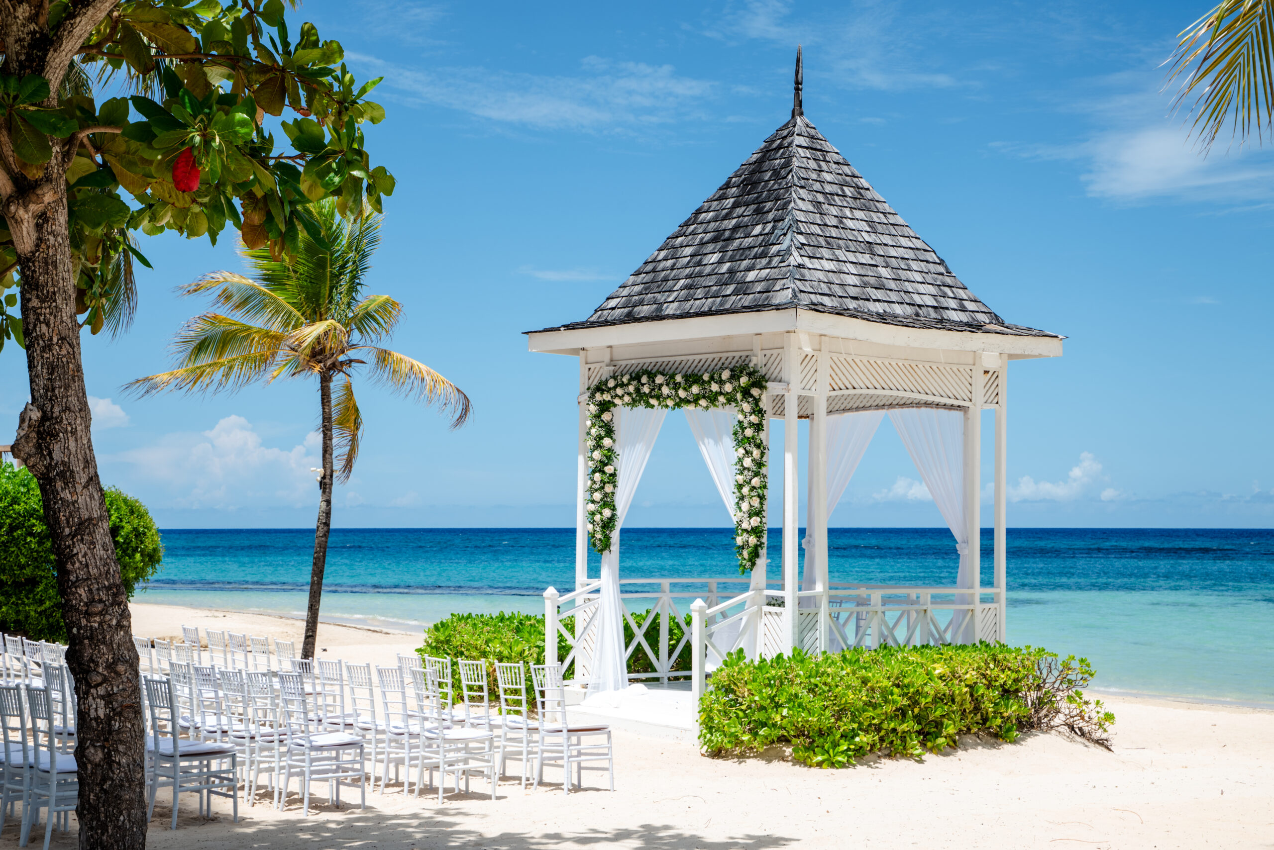
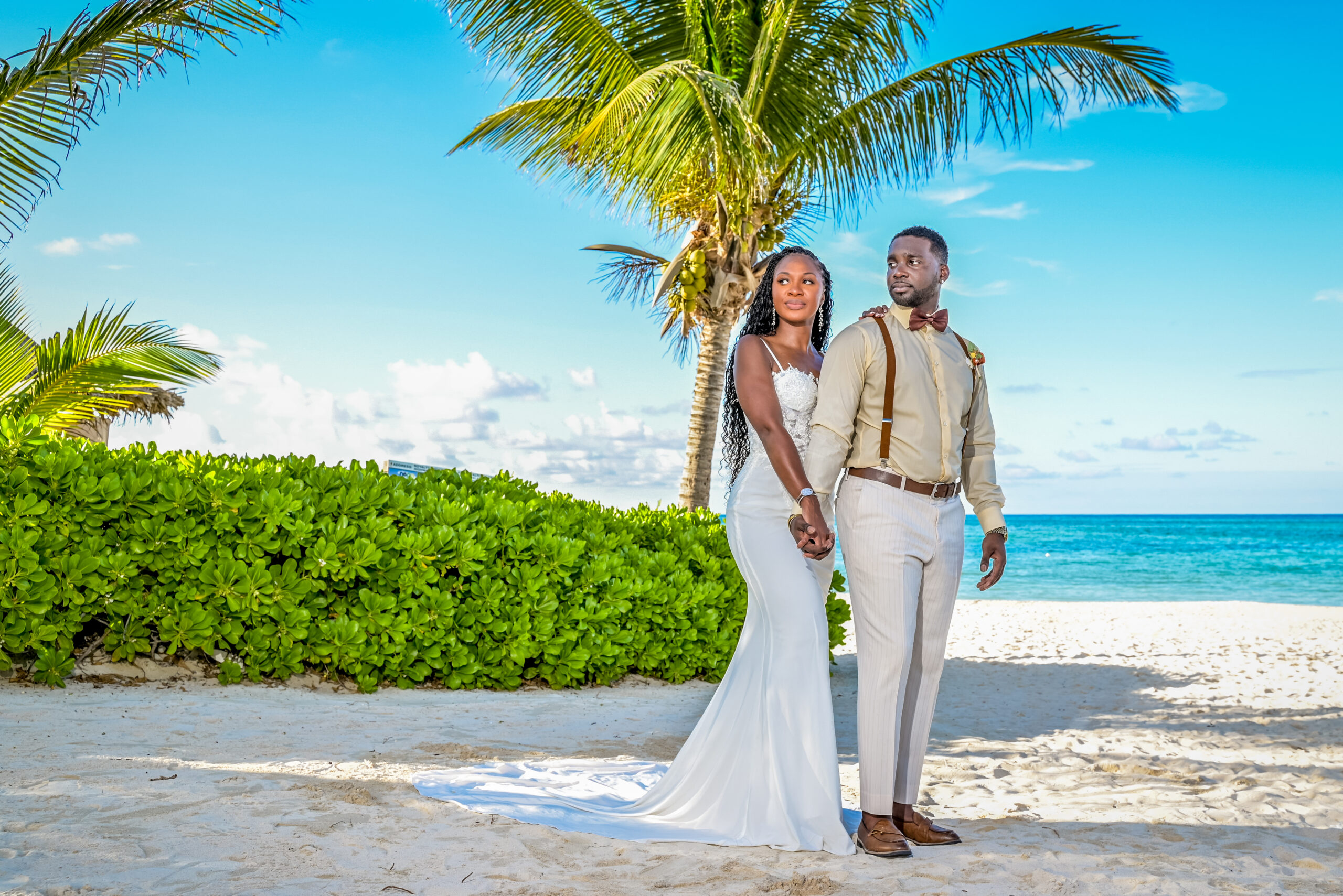
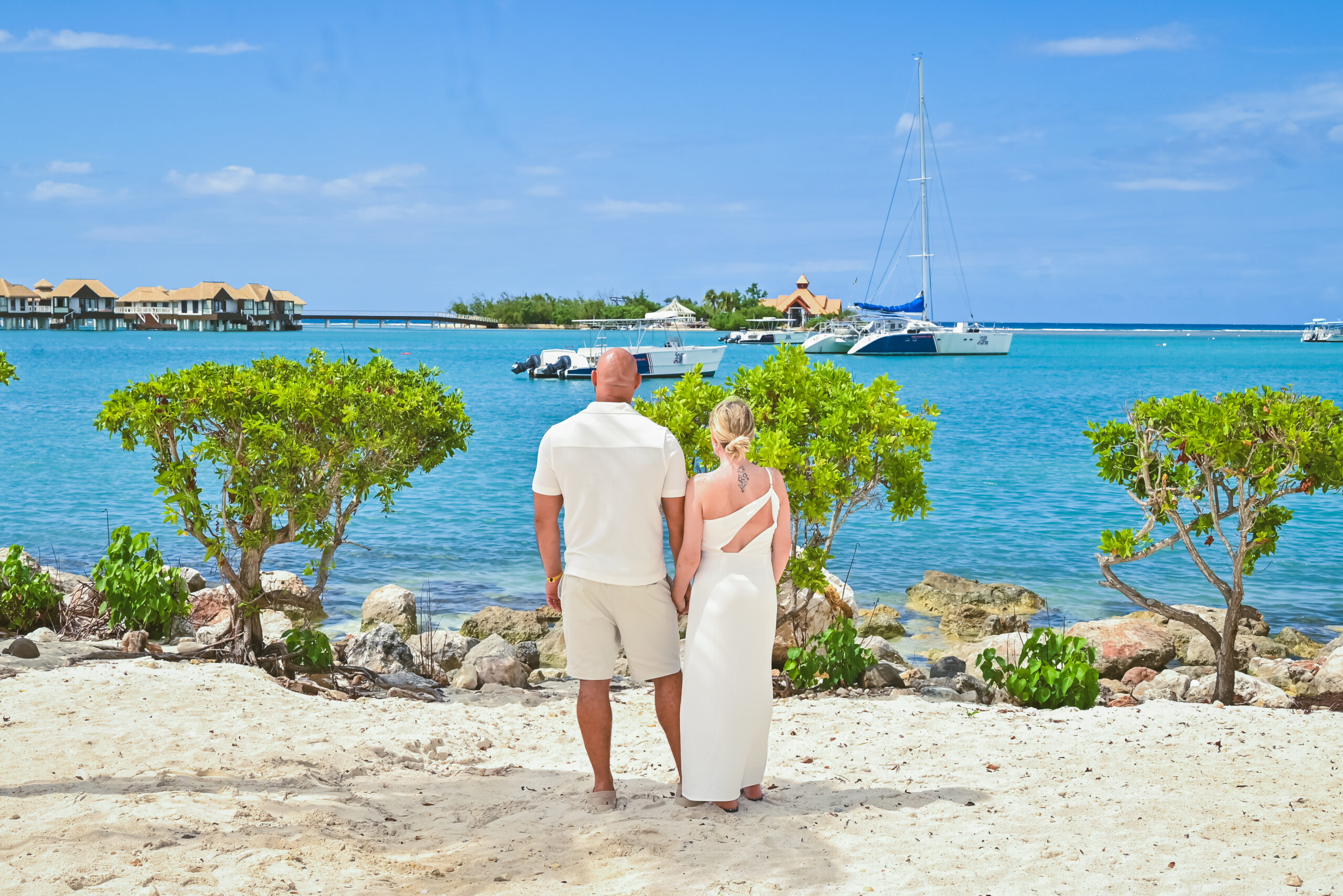
Coastal Venues: Warm sands, ocean blues, stone beige, and muted terracotta
Jungle Enclaves: Deep emerald foliage, ivory accents, and warm wooden tones
Boutique Architecture: Raw concrete, warm earth, stone, and bronze accents
In fact, allowing the destination environment to dictate your primary hues guarantees effortless visual harmony.

Building a Multi-Dimensional Palette
Relying on only two rigid colors can make your decor look flat and overly coordinated.
Consequently, professional designers recommend building a flexible, multi-tonal scale.
Base Tones (60%): Dominant neutrals like warm cream, stone, or sand for large surface areas
Secondary Shades (30%): Medium tones like olive, blush, or soft blue for linens and floral volume
Accent Colors (10%): Deep or vibrant shades like burgundy, gold, or charcoal for subtle focal points
In short, layered shades create depth and prevent your design from feeling artificial.
Color Palette Balance: Rigid vs. Organic Design
| Design Aspect | Two-Color Rigid Palette | Multi-Tonal Organic Palette |
| Visual Depth | Flat and overly matched | Layered, natural, and editorial |
| Venue Integration | Often conflicts with natural backdrops | Complements organic landscape textures |
| Floral Flexibility | Difficult to match exact flower dyes | Easy to source seasonal botanical blooms |

Testing Colors Under Direct Sunlight and Evening Light
Colors change dramatically as natural light shifts throughout the day.
For instance, pastel tones look ethereal during golden hour but can wash out under harsh noon sun.
Because of this, reviewing fabric swatches and floral samples under direct daylight and warm candlelight is essential.
Selecting timeless, muted tones over fleeting viral trends ensures your photo gallery remains timeless decades later.
Conclusion
Selecting a timeless wedding color palette is about complementing your natural setting, not forcing a rigid theme.
Ultimately, balanced tones create an inviting atmosphere where moments flow effortlessly.
When you step away from rigid protocols, you create breathing room for genuine interaction, spontaneous laughter, and poetic visual moments. Emphasizing authentic connection over predictable timelines allows every detail to feel intentional, resulting in an unhurried Riviera Maya celebration that reflects your true essence.
For more destination wedding inspiration, styling tips, and photography ideas, connect with us on Instagram at Sirenna Studio Instagram.